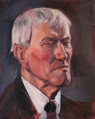
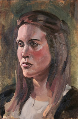
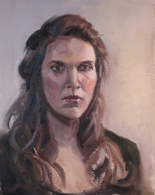
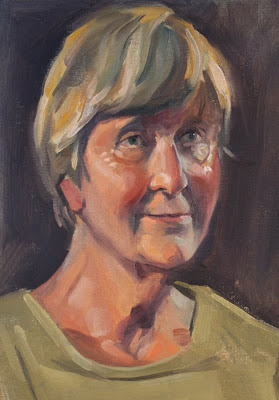
I have been very busy, sorry for not updating this for so long!
I am working on a larger scale painting that is eating up virtually all of my art time Should be done in the next week or two with it.
For now here are some recent Alla Prima portraits from the sessions at the West Hallam Portrait Group. I need to watch my edges a bit, some areas of these look really harsh to me now. Also have some issues with not breaking the forms with misplaced values but having fun and learning a lot through doing these.
The top one is the Mayor of Erewash.
Cheers
Jake


10 comments:
hey man, these are great- the drawing and tones work really well, nice brushstrokes too. Be a bit careful with colour temps, I think in some places it's too cool or too hot, usually i think it's necessary to keep them in a fairly close range.
that super cool digi piece below didn't have this- so maybe its an oils thing- try mixing "colour strings" pools of the same colour going down in tone, and then that way you can mess around with how to do colour shifts without worrying about the tones. I don't know if that makes any sense, but I have a feeling it won't take much effort to try a closer range
sorry that's different colours, so one for red, black, yellow, etc. going maybe 4-5 tones each colour.
Thanks Rod,
I really apreciate the advice. I feel like I am in a bit of a void out here in Derbyshire, I do not get any contact with painters who have similar goals/ process to myself.
I agree completely about the colour shifts. The red on the 3/4 girls cheek screamed at me once it was up on line but i resisted reaching for photoshop to knock it back.
I do use colour strings and then add in hue shifts from my base mixes where i see them but only around 3 values per colour typically. I also tend to mix my shadow side flesh tones from a different base to my warm light side. This might be breaking the harmony a bit.
I have been thinking of switching up to the Zorn limited pallete as i feel like maybe i am trying to run before i can walk with these pieces?
I think i just need to take more care across the board. These are painted quite frenetically and I feel that my hierarchies (tone,edge & saturation)all end up paying the price (as does the accuracy of my block in drawing).
I think it is case of honing my observation skills further. When i see a really obvious hue shift (like cheeks, noses etc i tend to exagerate it im my painting. I think you are quite right that these relatoinships are far more subtle than i am getting them down.
Looking forward to the next session to see if i can rain things in a bit.
Thanks again for taking the time to post its great to get some input from an artist of your calibur.
Great work Jake, really inspiring.
Thanks for you comments on mine, and for the advice, which is always gold.
nice work Jake! the mayor is pretty evil looking bloke eh! can't make it on the 12th unfortunately; prior commitments :(
Impressive work Jake - think the last one's my favourite, her expression carries through really well.
last 2 are the ones that work best for me, just so you know!
Excellent man, good to see you keeping up the portraits. I really need to join you on doing some of these, if only to find out what a colour string is.
Hope you're well mate.
Mr. Pigdog, I've lurked you here. I was hoping you or any one could provide a quality link to this color strings method. I saw a tattoo ink cup set up, dozens of cups, I think he was probably doing this, but I cant find anything solid on the method. Thanks and continuing to love the work. Cheers
Hi Tony, thanks for popping by mate.
Ben: hope to see you soon.
Mya: Cheers!
Aidan: Thanks!
Adam: when are you going to come back and visit us in the midlands my talented young friend. If you can find a portrait group in your area then pop along, its really exciting to try and nail a piece in an evening (even if you fail!)
Chris: I am not an expert. For me i tend to mix a darkest version of an intended colour (say the flesh tone on the shadowside as an example) and then mix, say, 4 increments of it moving up the value scale. When you add white it cools a mixture down in colour temperature so you might need to add some warmer pigments to maintain the correct hue. I tend to mix a pool of a colour and then mix satelites from it where i ajust the hue slightly. I am too heavy handed with it to be honest.
If you want to get technical with this stuff then google the Munsel Color System. Its not for the faint of heart though, I do not use it myself but its worth having at least an understanding of its principles. Graydon Parrish is a big exponent of it and his stuff speaks for itself. The rational painting forums is worth signing up to if you want to explore this stuff. A wealth of information in that community.
Post a Comment